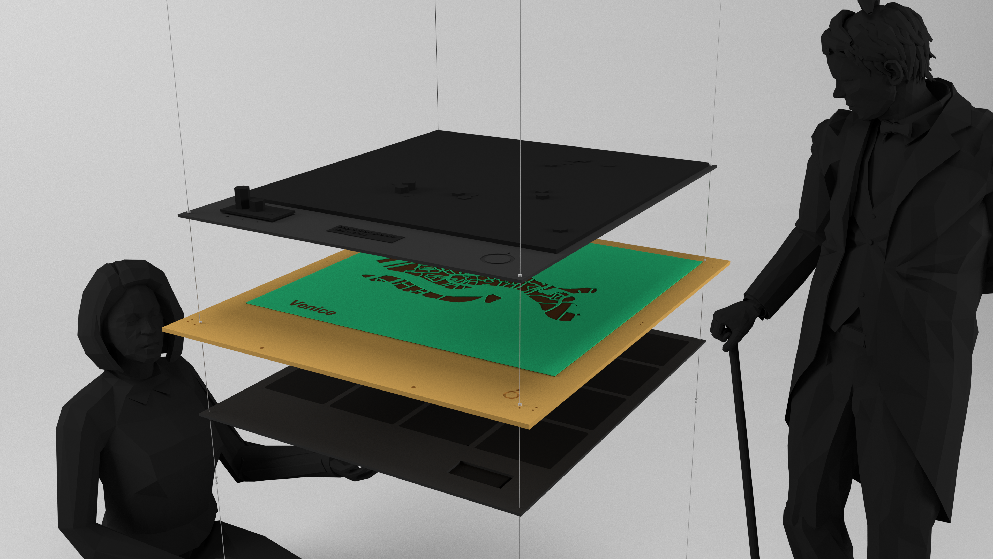
3D Data Map is an installation that lets the audience interact with geographical data in an intuitive and manual way. The base map layer consists of a frame with a plexiglas engraved map of the geographical area in question. Different data layers can be placed above or below the base map. Data layers, when not on the map, can be hanged like posters around the main map installation, functioning as contextual information while being ready to be picked up and placed on the map.
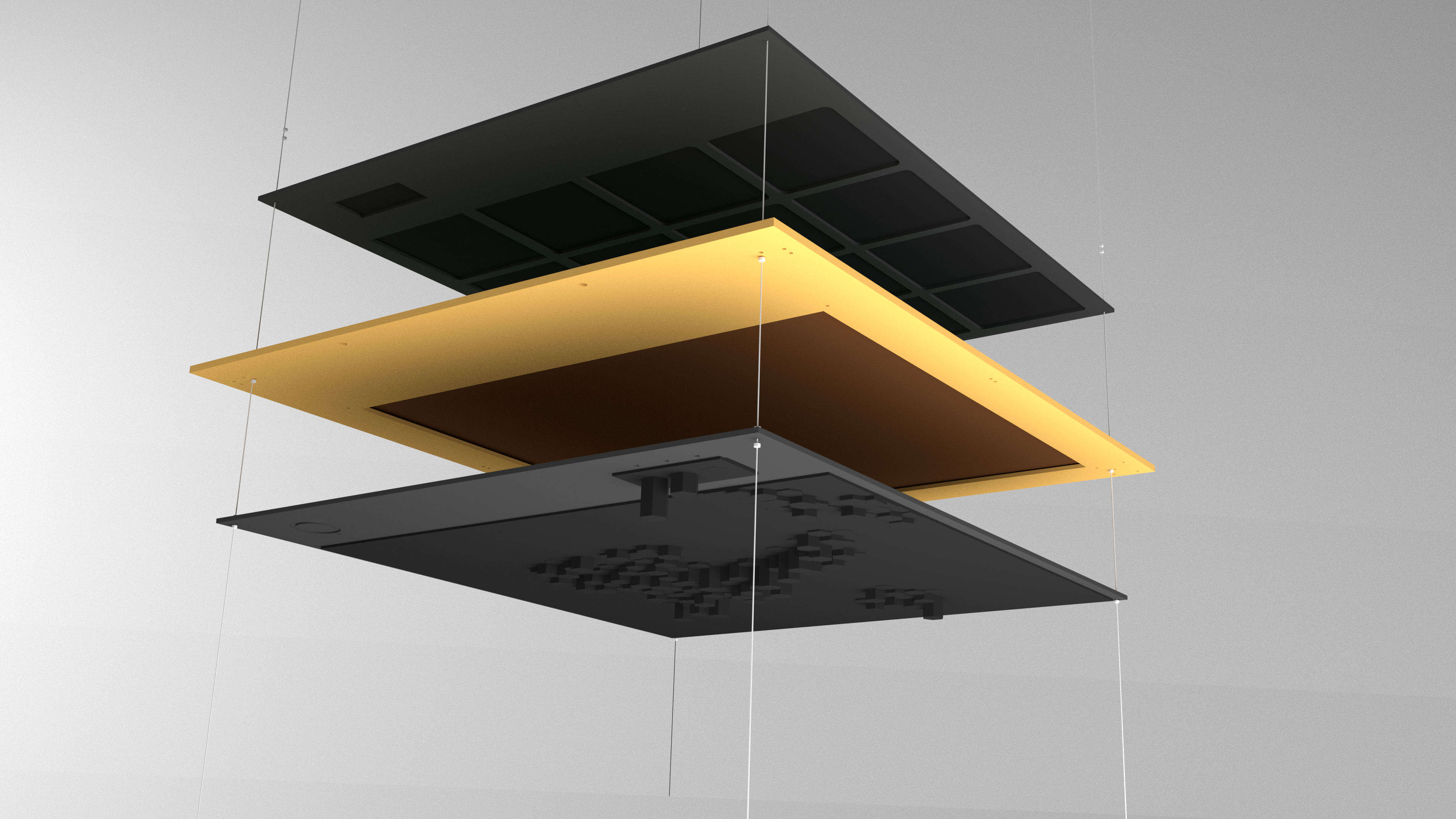
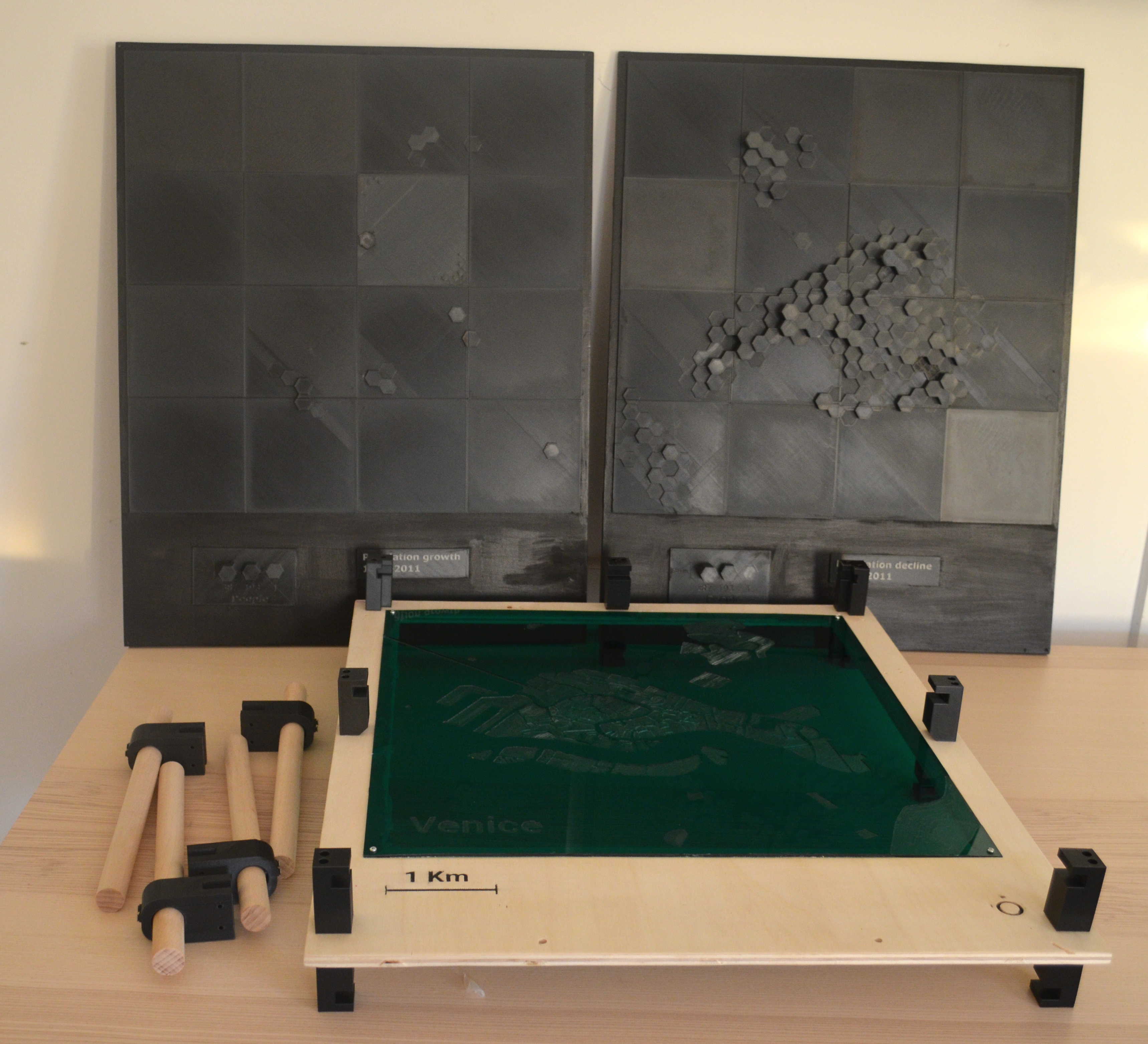
A key feature of the designed 3D map frame is that it allows 2 data layers to be on the map at the same time, one on the top and another at the bottom. This is especially useful if you want to visualize a phenomenon that has positive and negative values: the base map layer functions as the 0 value of the axis, with positive values mapped on top and negative ones below.
The 3D data layers all have a legend and a title. The base map frame also features two holes that allow it to expand to offer additional space for your story (you could attach wood sheets with text engraved, add paper sheets, etc.)
While the proposed installation design consists of many components, the support ones are not dependent on the data you use to replicate the tutorial, and you can directly download the 3D model files we created and proceed to their fabrication. This way, you can focus your energies only on the components that vary according to the data you start with: the plexiglas base map and the 3D data layers.
Possible variations
The tutorial illustrates how to create a 3D hexagonal grid with the hexagons extruded as high as the data value they represent, but the exact same procedure could be used to extrude other types of
geometries, like buildings or census tract boundaries, depending on the .SHP file you start with.
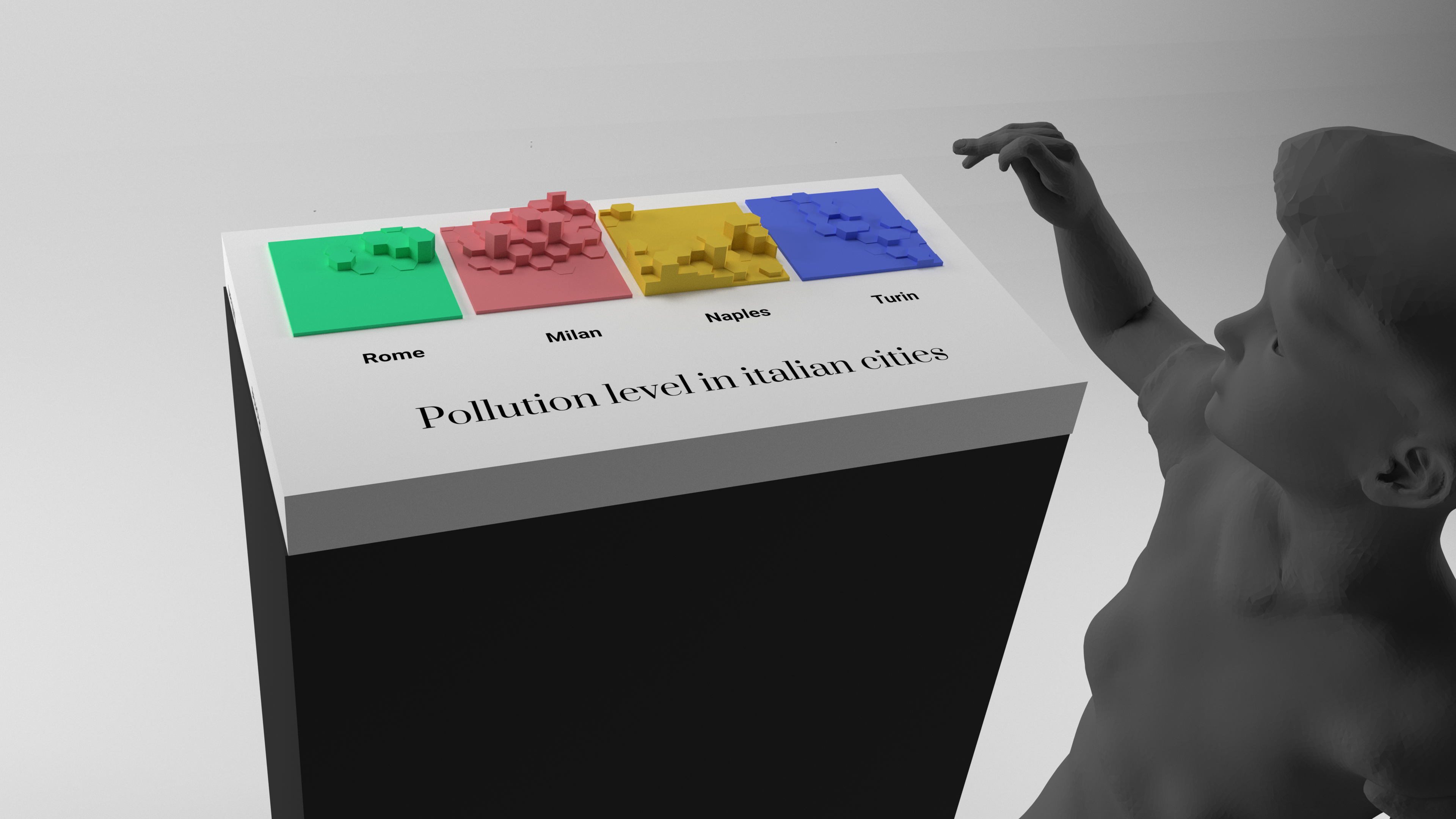
A neat feature is that the core techniques and workflows used in the tutorial can be repurposed to create a grid with
small-multiples maps, for example with each section showing the geographical distribution of different variables in the same area, or showing the geographical distribution of the same variable in different areas.
You can also play around with the
materials, their colors and appearances: we used plexiglas for convenience, but the base map could be made any other material that can be carved by a CNC. We used black for the data layer, but you could choose the colors that suit best your story: for example you could print positive values in green and negative ones in red, or use a multiple colors if your 3D printer allows it.
Of course, if you have the budget and space, you could also adapt the tutorials that refer to one of the data layers to create a
giant walkable map.
Lastly, in our prototype we kept things simple and only drew land-water boundaries in the base map. If you have the time and the CPU (or if you are working on a very zoomed-in map), you could add
details to the base map, like roads, buildings, parks and rivers. You could also give each of these elements a different color, like green for parks and black for buildings, by layering several thin acrylic sheets under the main layer, and having the CNC cut through at different depths depending on the element and the color you want to depict it with.