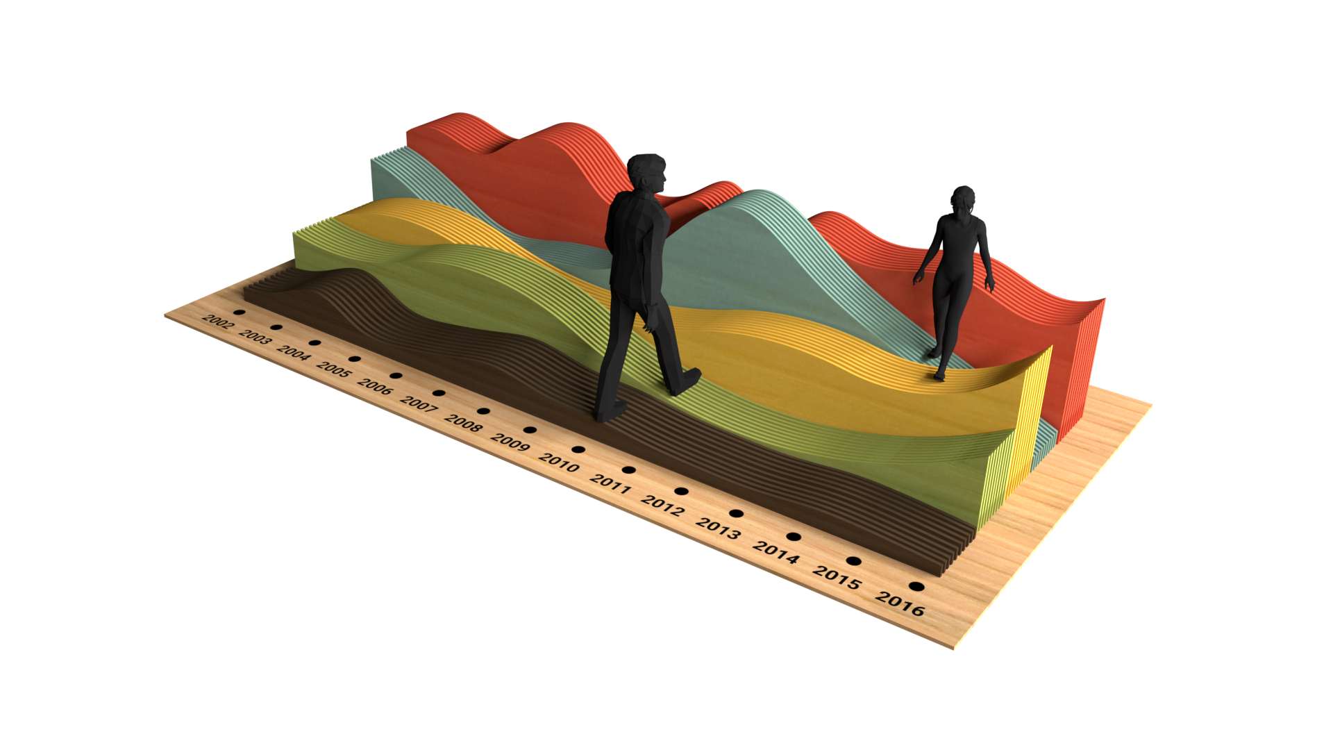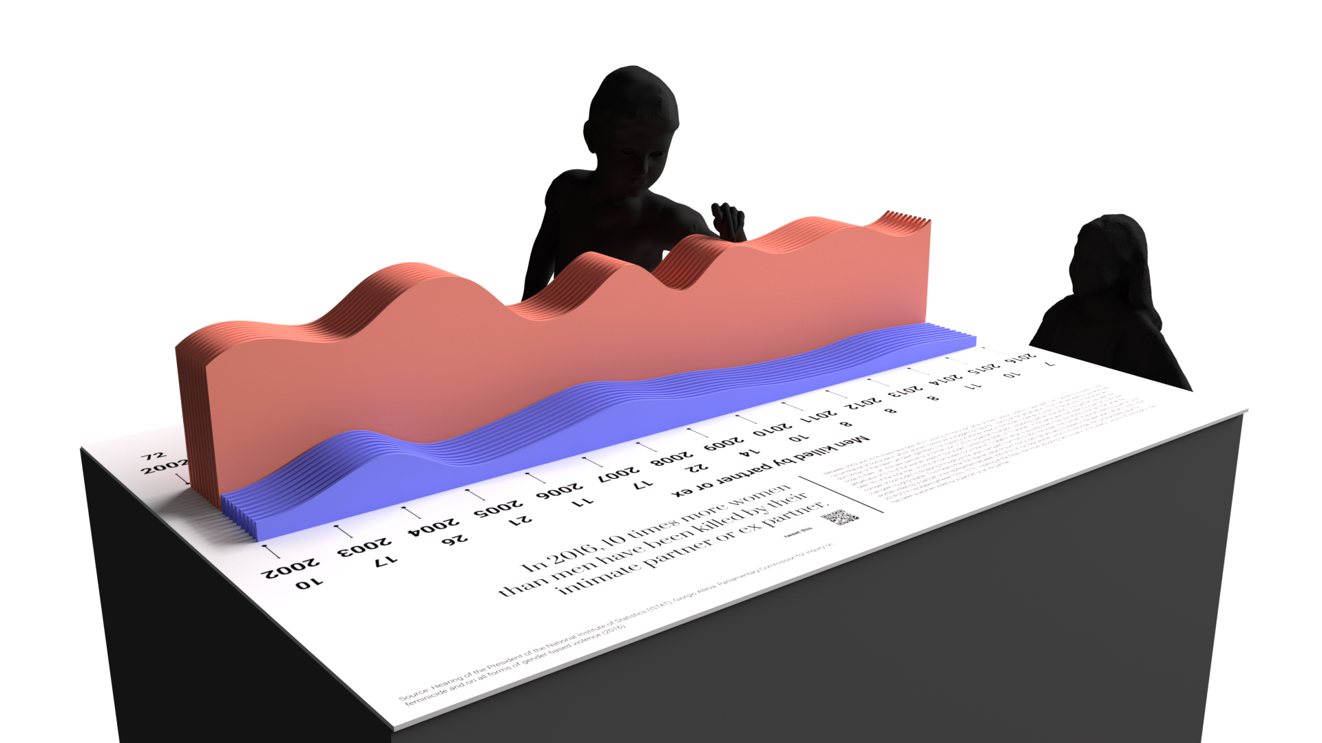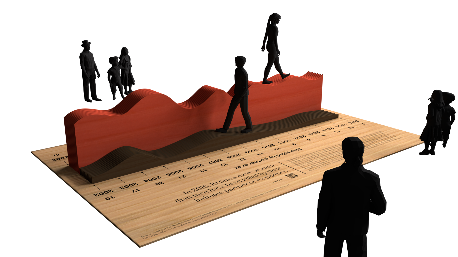
In an optimal scenario, there would be multiple line charts, each for a dataset or subset of a dataset. This way, the data walk would allow exploring correlations and relationships between datapoints. The installation could be particularly useful to depict inequalities - like forms of racial and/or gender discrimination, wealth distribution, etc - by positioning two of such walkable line charts right next to each other. The participants would then walk with one foot on one chart and a foot on the other, literally feeling the unbalanced situation and the disparities through the awkwardness of walking with feet on two different levels. It is possible to add text, grid lines, axis and annotations to the data object itself or on its base.
Possible variations
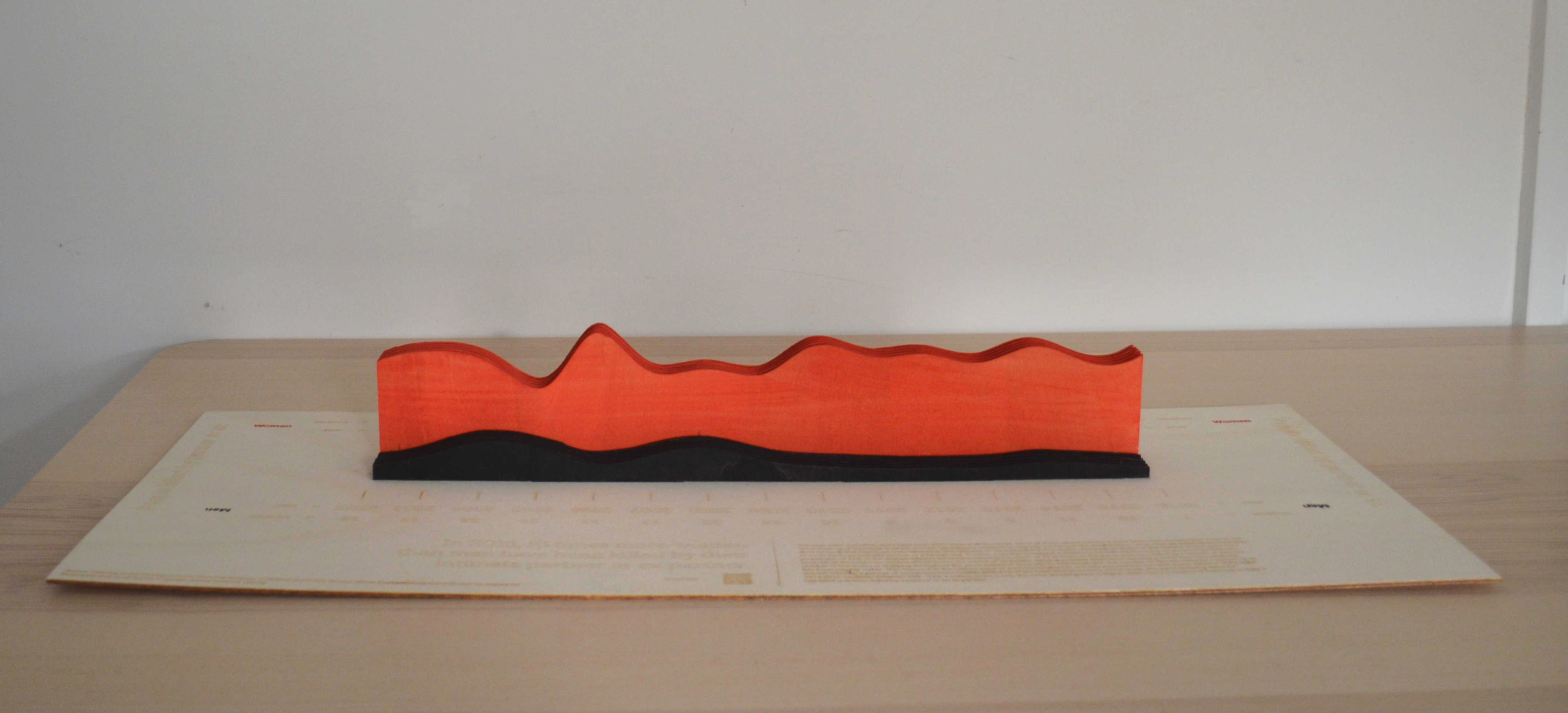
Apart from this usage, a similar workflow to the one proposed could be used to produce smaller versions of such object. Such charts could be of medium size and be placed on a tabletop, from which participants can touch, caress and walk around the data object. Alternatively, the workflow can be applied to produce even smaller versions of the line chart(s), which can be given out to the audience as a remainder of their visit to the event. In terms of appearance, the line chart can be designed to have either straight or curvy lines. If the project consist of the big walkable data installation, then you should opt for the curvy lines, so that participants can climb upon the points. If you anticipate that you will need to update the data after a while, you can also design your project with junctions, in a way that new pieces of data can be inserted as you receive new datapoints.